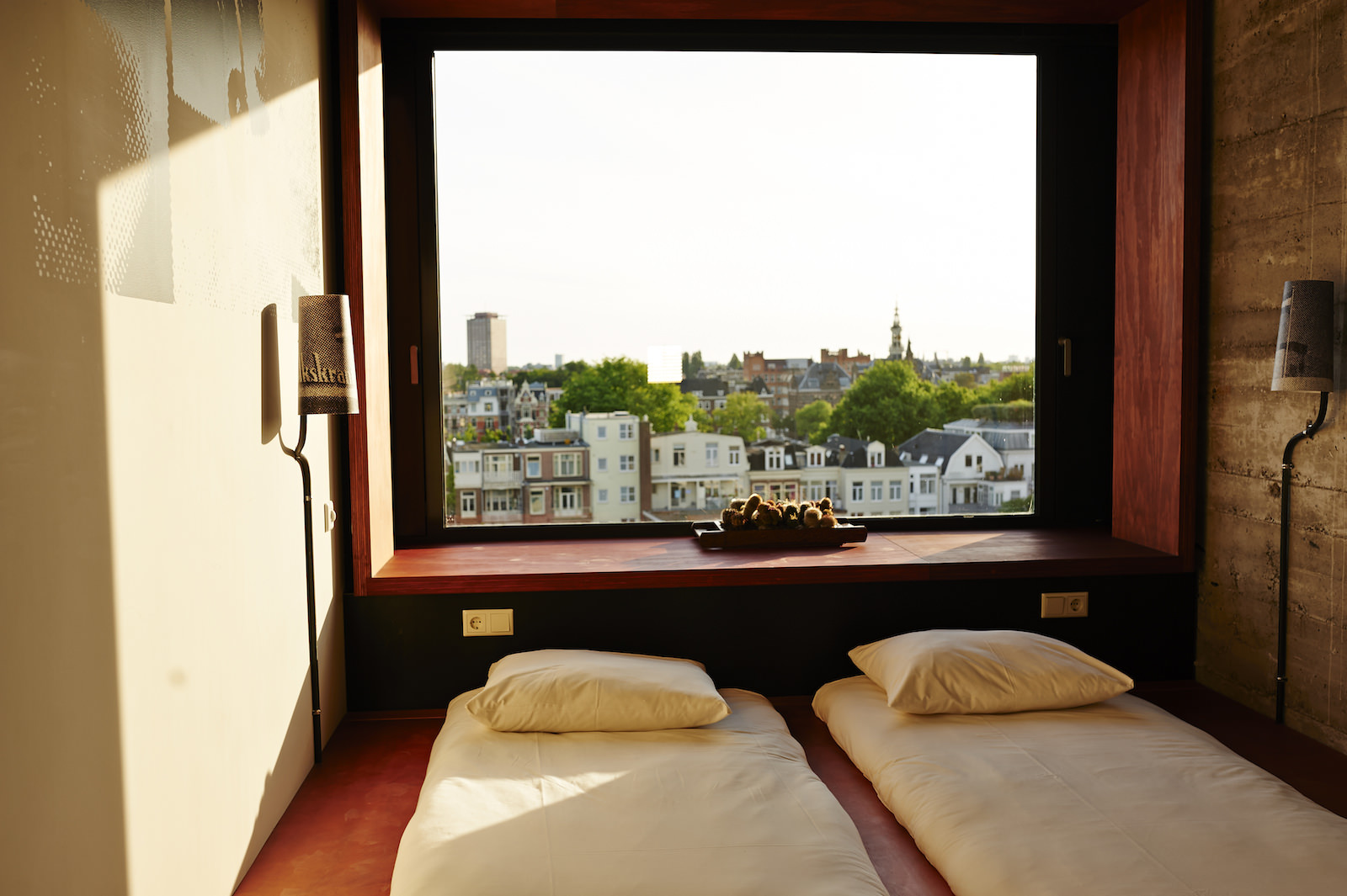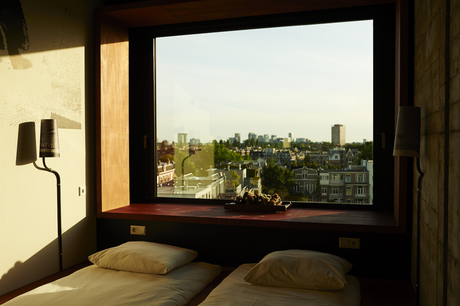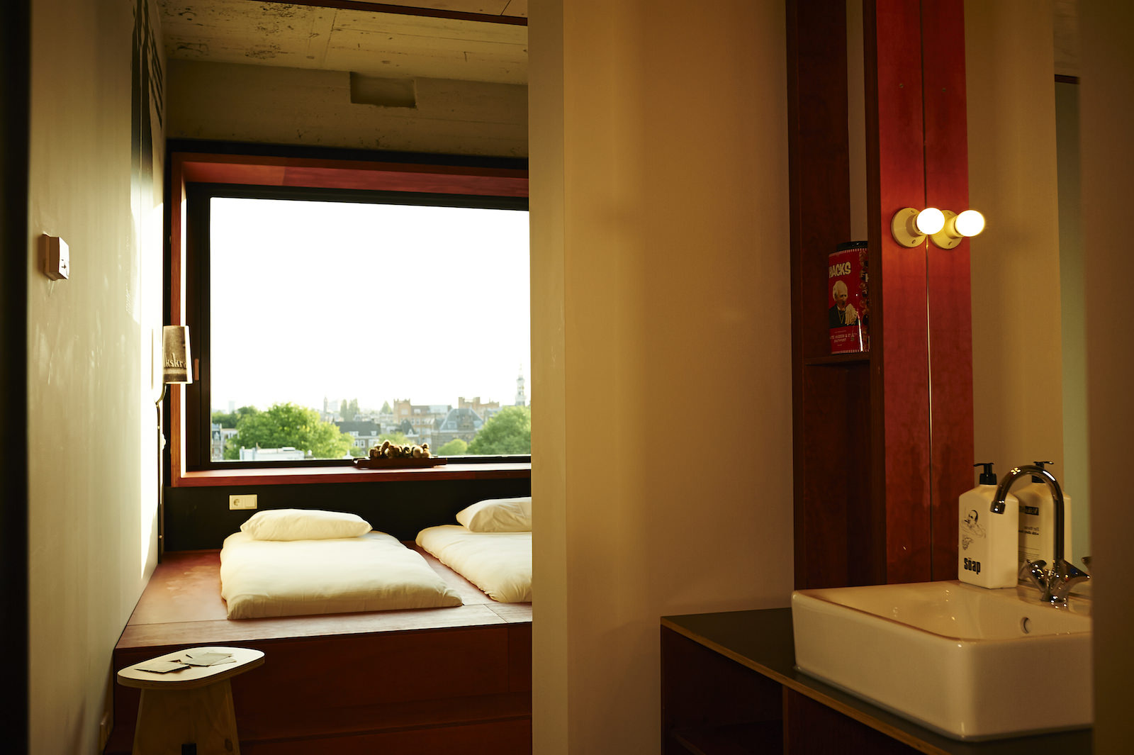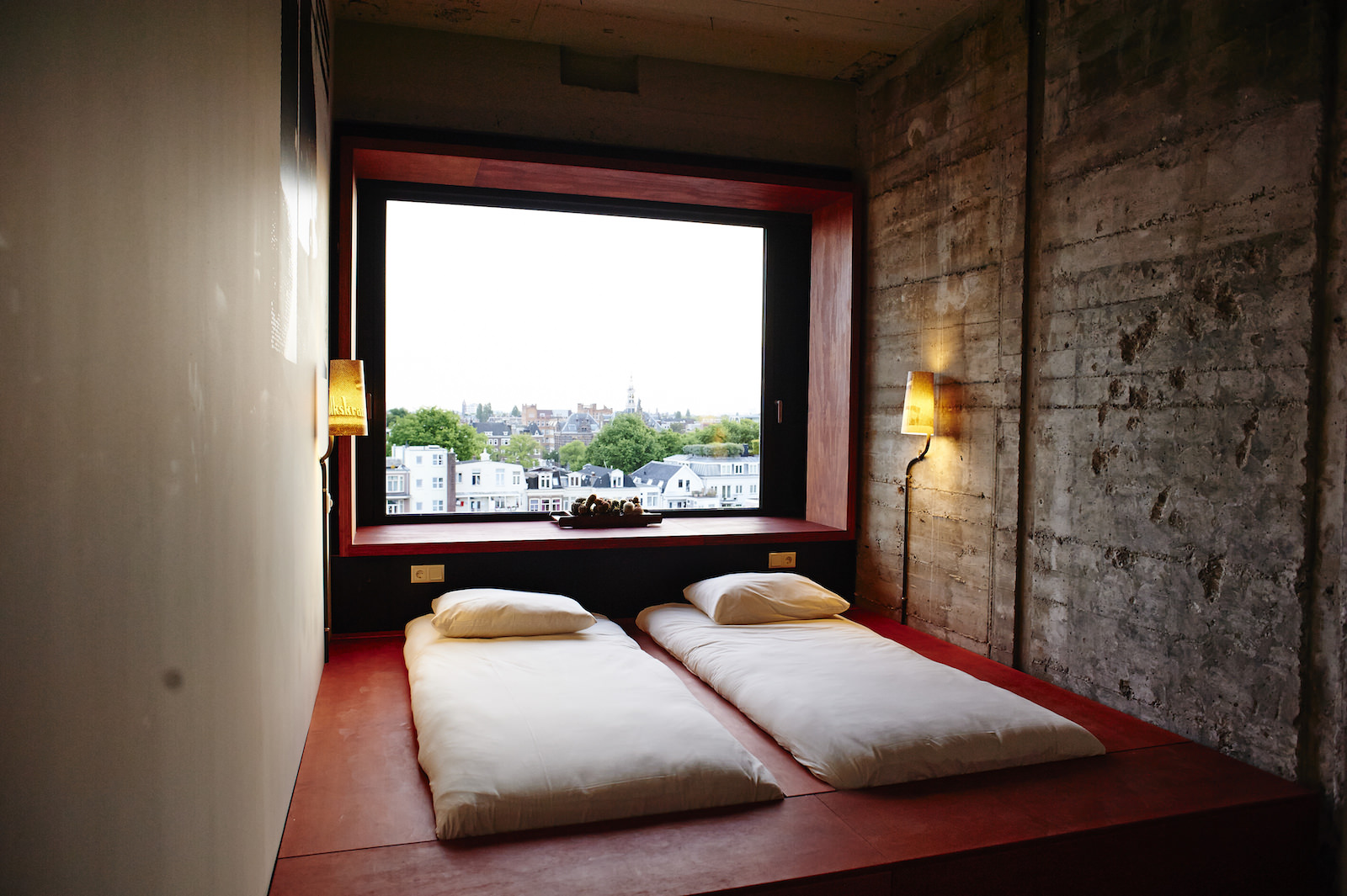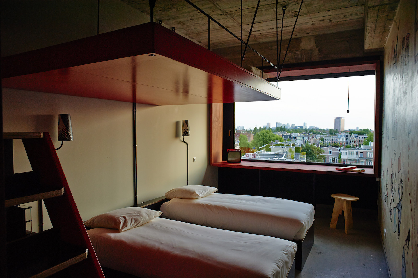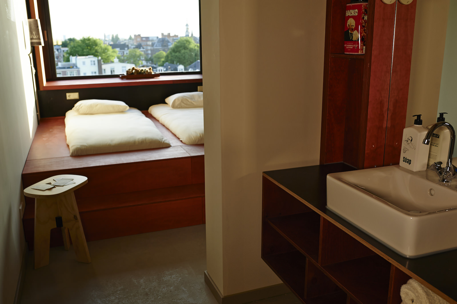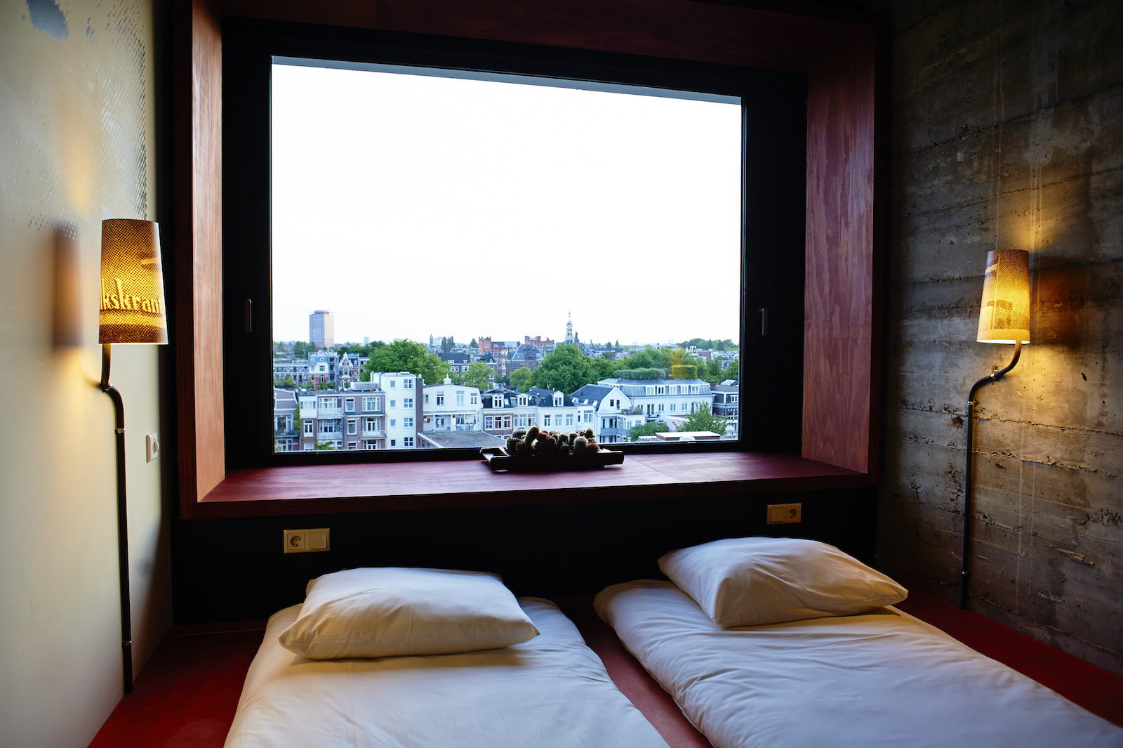
Located in a building formerly used as the headquarters of a local newspaper, the Volkshotel Amsterdam, now home to 172 hotel rooms, ranging from cosy hideouts to huge hangouts, claims to actually be a hotel for everyone, welcoming punk rockers, single moms, stockbrokers and poets, dandies and dishwashers.
Volkshotel Amsterdam is housed in the former Volkskrant building, a 1960’s concrete structure that is open, optimistic and functional. When it opened in 1965, it was the most modern newspaper building in Holland. Architect brothers Kraaijvanger designed this building nicknamed ‘The White Swan’. The original design was full of references to the buildings’ function. The façade was covered with 1,5 million white tiles – almost the same amount as there are characters in one newspaper. The seven floors of the facade referred to the text colons, with the big masthead ‘De Volkskrant’ on top. As years went by, one by one the white tiles fell down. The white and bright facade turned grey. Many called the Amsterdam Wibautstraat the most ugly street in the city. The White Swan seemed to have flown away.
After the renovation, the original design remains as much as possible. Architect Steven Steenbruggen achieved a building that has kept up with its time but still honored its past. The facade is white again. The white tiles are replaced by white plasterwork including thousands of lines. The top floor, once the old journalist canteen – is completely rebuilt as a restaurant / nightclub Canvas including proper isolation and 360 degree view over Amsterdam.
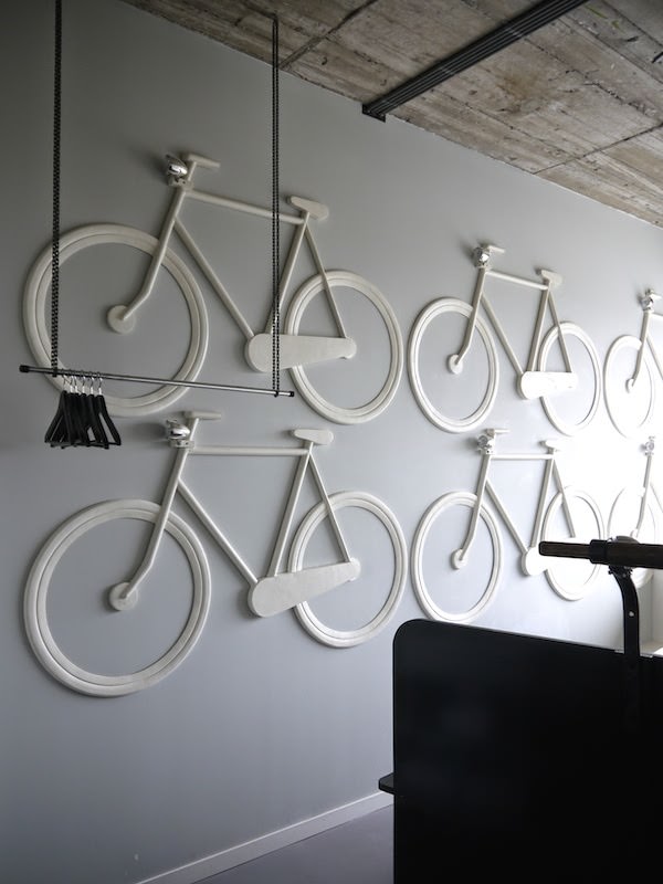
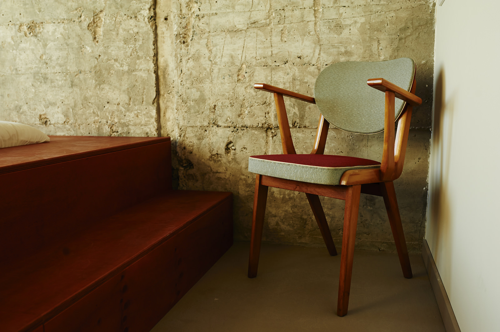
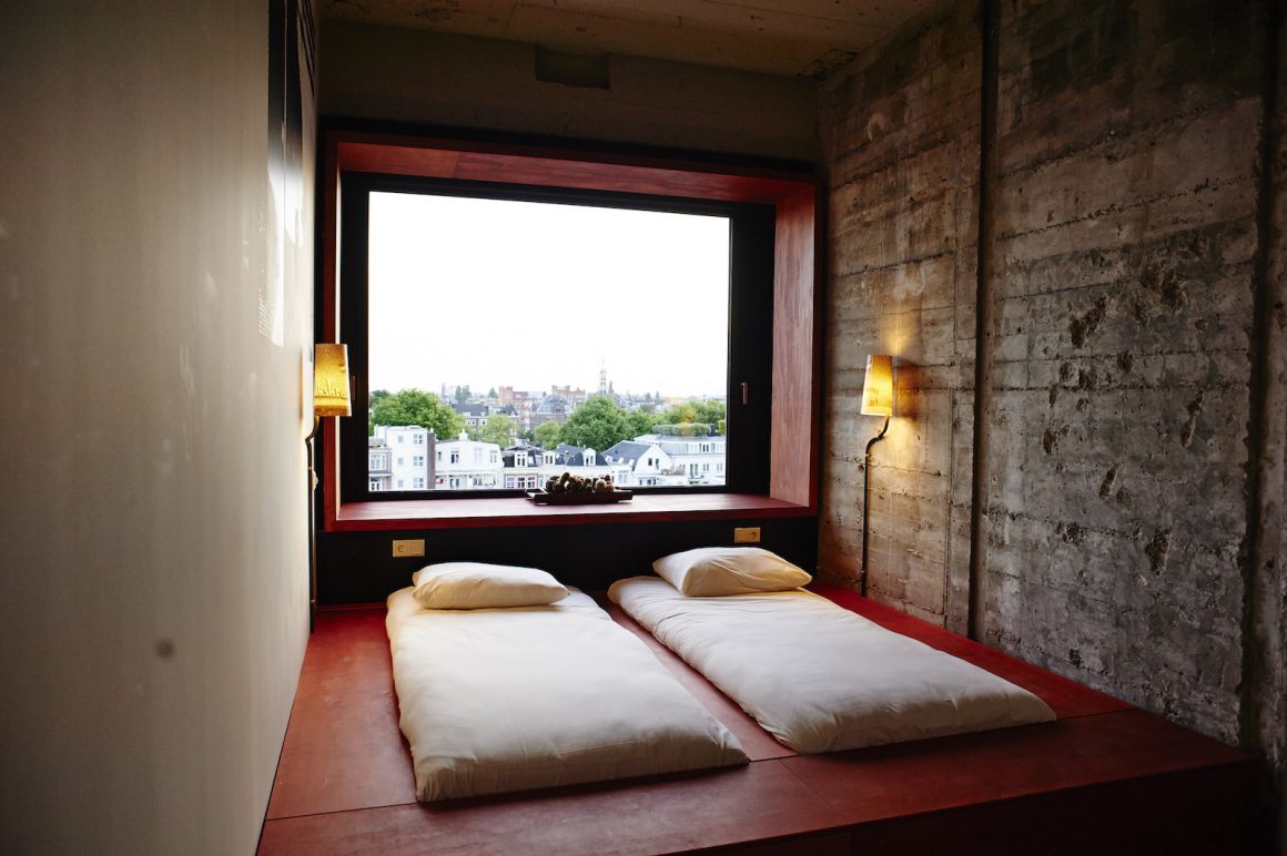
Most spaces inside this refurbishment are the work of Interior designer Bas van Tol of Studio Müller Van Tol, renowned for the celebrated interiors of Amsterdam Club 11, Club Trouw, Restaurant As and Unseen photo fair. Bas van Tol has created an interior full of magnified newspaper cut outs and original elements of steel, wood, concrete and glass. The design is inspired by the physicality of newspaper production and the vanishing world of paper, ink and photographs. Examples are the ink raster patterns that enliven the elongated counter and enlarged, overblown cut-outs of ‘De Volkskrant’ masthead that adorn the ground-floor walls. The designer made use of iconic photographs from the newspaper’s archives, showing groups rising up in defines of their ideals on the corridor walls. Made up of ordinary people, these counter-movements — provos in the 1960s, hippies in the 70s, squatters in the 80s — defined the mood of their eras, just as the images define the spaces of the hotel.
All images shot by photographer Mark Groeneveld.